考虑兼容性和优化的细节:
- favicon:适配桌面端、ios和安卓端
- 图片:选择合适尺寸、使用webp格式、使用srcset适配
性能评估工具:LightHouse
参考课程:Build Responsive Real-World Websites with HTML and CSS
视频 | 源码
基于React的响应式单页应用开发、优化和部署
兼容性&优化
favicon
react项目中的public目录下
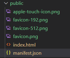
在index.html中设置favicon,不同的端有不同的设置
桌面端
需要对应图片分辨率为64x64
1 | <link rel="icon" href="%PUBLIC_URL%/favicon.png?raw=true" /> |
ios
需要对应图片分辨率为180x180
1 | <link rel="apple-touch-icon" href="%PUBLIC_URL%/apple-touch-icon.png?raw=true" /> |
android
需要两种图片尺寸192x192,512x512
1 | <link rel="manifest" href="%PUBLIC_URL%/manifest.json" /> |
需要在同目录下的manifest.json文件中配置图片路径
1 | { |
图片
查看Network,可以观察到传输了4.1MB的数据,其中大部分是图片,需要对图片进行压缩

图片尺寸

通常来说是这样判断,以上图为例:
- 一开始有一张很大的图片
- 在浏览器里检查图片能够显示的最大宽度(554)
- 对这个数值四舍五入后×2(600×2=1200),以适应二倍屏的手机
webp
使用Google的在线图像压缩工具:Squoosh
目前最优的图片格式为webp,可以不断调整找到最佳压缩比

srcset
webp不能在所有浏览器上支持 https://caniuse.com/?search=webp
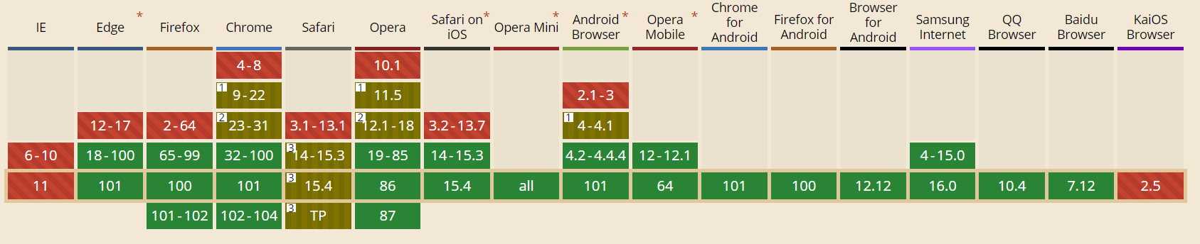
所以可以使用srcset做兼容
1 | <picture> |
解读:
- 用picture标签包裹住img标签
- source标签声明可以使用的源和类型
- img标签中的src属性赋值为想要默认显示的图片,这里设置为webp格式的源
- 浏览器会根据自己支持的源请求图片
LightHouse
参考
chrome自带的性能评估工具
- 可以选择设备,评估类型,根据报告修改


性能 Performance
Properly size images
Serve images that are appropriately-sized to save cellular data and improve load time. Learn more.
修改图片大小,小窗口不需要大图片
解决方案:考虑用 srcset
Serve images in next-gen formats
Image formats like WebP and AVIF often provide better compression than png?raw=true or JPEG, which means faster downloads and less data consumption. Learn more.
解决方案:图片推荐使用webp格式,参考 webp
Eliminate render-blocking resources
Resources are blocking the first paint of your page. Consider delivering critical JS/CSS inline and deferring all non-critical JS/styles. Learn more.
引入外部的字体和iconfont会这样
解决方案:todo
Ensure text remains visible during webfont load
Leverage the font-display CSS feature to ensure text is user-visible while webfonts are loading. Learn more.
引入外部字体和iconfont时会产生这个问题,字体加载会导致文字闪烁
解决方案:todo
Image elements do not have explicit width and height
Set an explicit width and height on image elements to reduce layout shifts and improve CLS. Learn more
图片没有明确宽高,下载完图片之前浏览器没法知道图片的宽高,会导致布局闪烁
解决方案:
定义img标签时先自带宽高,尽量写得和真实图片一致
1 | <img src={Meal1} className="meal-img" width={700} height={467} alt="Japanese Gyozas" /> |
在css中,通常是设置宽度100%,这里需要加上高度自动
1 | .meal-img { |
-